
Thursday, 8 March 2012

Tuesday, 6 March 2012
THRILLER OPENING INSPIRATIONS
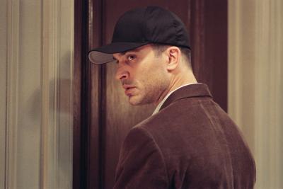
In order to develop ideas of the characters age, costume, gender, setting and props, we watched trailers and opening sequences of films. As a group we were intrigued by the stalker character from 'Prom Night' and wanted to make our obsessed character similar to him. We thought it would be best to make our opening scene simple and not reveal too much of the plot or the stalkers identity. So we created a character profile. We wanted him to be believable as Venesssa's terrifying stalker, without crossing over into monster.



Monday, 5 March 2012
CAMERA SHOT INSPIRATIONS
As we have studied many thriller openings, we were told to research about the conventions of a thriller. We have thought of some conventions and are using them to highlight to the audience the genre of the opening (psychological thriller).
As shown in earlier posts, non diegetic sounds are obviously conventional of thrillers, as they build up tension and suspense.
In the previous post it was emphasised that our main inspiration was The Black Swan, however in terms of directors we used Stanley Kubrick as an inspiration. Stanley Kubrick in several of his films used close ups of eyes in order to build up tension and enigma. The fact that it was the eye made it significant because it allowed us to be in the character's place and see things from their perspective. It was almost as if we were the characters.
We are going to use Stanley Kubrick's motif of close-up of the eye in order to build enigma and to keep the audience interested in our thriller. Examples of these are in 'A Clockwork Orange'

As shown in earlier posts, non diegetic sounds are obviously conventional of thrillers, as they build up tension and suspense.
In the previous post it was emphasised that our main inspiration was The Black Swan, however in terms of directors we used Stanley Kubrick as an inspiration. Stanley Kubrick in several of his films used close ups of eyes in order to build up tension and enigma. The fact that it was the eye made it significant because it allowed us to be in the character's place and see things from their perspective. It was almost as if we were the characters.
We are going to use Stanley Kubrick's motif of close-up of the eye in order to build enigma and to keep the audience interested in our thriller. Examples of these are in 'A Clockwork Orange'

THRILLER OPENING INSPIRATIONS
Before creating our thriller treatment and storyboard, we studied many thriller openings for inspiration. We acquired and developed thoughts and ideas from thriller openings: Black Swan, Prom Night, Loved Ones and Cape Fear.


Black Swan: Initially we had in mind that Vanessa's passion would be swimming and that she would be the captain of the swimming team. After discovering that the pool was inaccessible, we were forced to reconsider our options, though we still wanted Vanessa to have some sort of athletic passion. Then dance (ballet) came to mind. After having studied Black Swan we realised how effective, opening with a dance routine could be, in substitute of her swimming. There is two characters in the opening of Black Swan; the woman in white and the male in black. The man is very creepy, the completely black costume establishes him as a dangerous, enigmatic character which contrast the innocence and fragility of the girl in white. We liked the idea of this subtle, symbolic distinction between the villain and naive victim and we are applying this technique to our own opening title sequence.
THINGS TO COVER 5/03/12
- Re-do final storyboard to perfect every shot
- Scan the story board and post it on blog
Thursday, 1 March 2012
PRODUCTION COMPANY EXPERIMENTATION
We have decided to call our production company 'Fox Light Production', Below are a few ideas for our logo.
 This logo is very simple and unique. We decided to do it in black and white to keep it easy and simple. The fact that the font is easy to read and the film reel is there symbolizes film making. We did not want our production company to reflect Fox Productions because they usually produce very mainstream films. Our thriller is psychological and therefore is quite niche comparatively. Therefore our production company reflects more towards Lionsgate as that is the most niche production company and usually does thrillers. Lionsgate too have a very monotone logo so we decided to maybe do something that is similar.
 The above logo is also efficient to use as it is also simple. We only used few colours. The fact that there is a background light reflects our production company's name. The camera's lense is the focal point whereas the rest is blurred. This suggests a more technical production company and looks more mainstream than the first one. However we feel that because we have used a simple font it doesn't complicate things.
 Although the above logo is good as it does hint at the 'light' for 'fox light productions', it looks more like a musical production company rather than for film. Therefore we don't feel that this will be sufficient for our production company. However the fact that there are only three colours used is good because it does not complicate things and like most production companies it remains simple and effective.
 Finally this was our last idea. The fact that there are typical drama masks, suggest it to be a dramatic drama production company. We used earthy colors to make it seem more natural. We used an easy readable font too. However this might not suit our film's story line, it seems more for theatre or like a drama production. It doesn't look professional enough for a film's production company.


TITLE EXPERIMENTATION
We have experimented with few font styles, to see which will be appropriate for our thriller. Below is the analysis of few fonts that may be worth looking into for our opening sequence.
 This font is quite child like and immature, and for our title sequence it may be useful, as it comes across as quite innocent. The fact that it is quite messy and not perfect, symbolizes the confused state of mind of the protagonist and it also enhances the importance of the story line. It is written in a paint like form, and suggests a chaotic story line.
 The above font is similar to the first one but it gives a more thrilling feel. The fact that it has hinges at the end of every letter implies a disturbing feel to it. Similarly because there are straight lines, it makes it seem very structured. This is ironic as the stalker in our treatment has a very structured plan, he too comes across very neatly and thus it could be suitable for our title sequence.
 This is one of our favorite fonts styles for the thriller because it is the most age appropriate and it also attracts the audience the most. The fact that it is easy to read, and looks like someone's handwriting is sufficient as it suggests the story line is about someone who is either a teenager or in school. It also will attract more of the youth as it looks 'hippy' and almost graffiti like.
 Finally this is also quite an appropriate font, as it hints at the story line. The fact that it looks like calligraphy suggests a very delicate story line. It looks quite feminine and therefore the audience will be expecting a girl to be the protagonist. It resembles the font of 'Black Swan' and you can kind of tell it will be about ballet or something very ladylike.


Subscribe to:
Posts (Atom)